
Explaining the Property Market with Several Charts
In this post, I share several charts that highlight the current state of Australia’s property market that may provide some clues as to where we are heading.
The first chart highlights why the Australian Government and the RBA don’t want a property crash. 57% of Australia’s wealth is tied up in real estate. Although in the past 12 months, since the first-rate rise, property prices have declined, the Loan-to-Value ratio at 24%, is good. Outstanding mortgage debt is at $2.2 trillion, a fraction of the total value of Australian residential real estate.

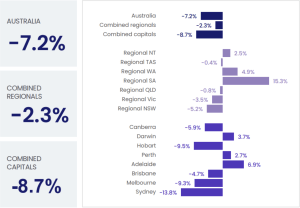
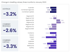
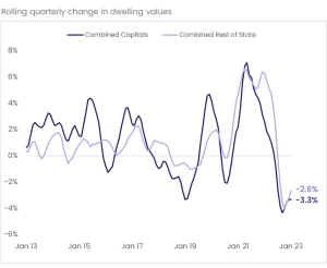
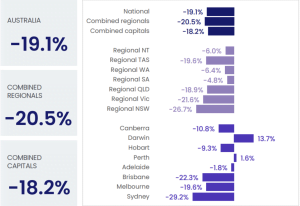
The annual rate of growth for Australian property is down -7.2% over the past 12 months, with regional areas feeling less of a pinch down -2.3%. And while the current fall in dwelling values is one of the most historic rapid rates of decline we’ve seen, I think it’s fair considering the aggressive and consecutive rapid cash rate increase bought on by the RBA. The rate of dwelling price declines is also easing across most of the country, a sign that the dust is starting to settle.
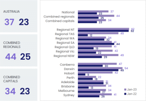
How are this rate rises and price drops affecting the market? Many people are sitting on the fence to see how things settle. The time it is taking to sell properties has increased. Regionally this has seen time on the market extend from 25 days to 44 days. Not as bad as we’ve seen it in the past. After the 2008 GFC was announced, average time on the market was 180 days. We are not in a GFC! The Australian economy is still strong, and the US has avoided a potential recession, too.
Of course, as buyer demand dampens, sales volumes are also down -19.1% compared to this time 12 months ago. We can also see that those who are selling are bringing their price expectations to align with the market if they wish to sell. In regional areas, this is a correction of close to 5%.

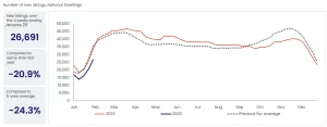
Property sellers are also sitting on the sidelines waiting to see what happens. This is causing fewer new property listings to come to the market. New listings are down -24.3% over the five-year average. In many ways, this is probably helping reduce the side effects caused by weaker buyer demand. We are also noticing that A-grade properties are few and far between, and when they do come available, they seem to be snapped up pretty quickly.
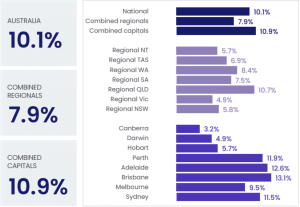
And onto our final chart, there is a huge rental market crisis. Asking rents are skyrocketing, and the shortage of available properties to rent is at an all-time low. Annual rent values increased by 10.1% to the end of January 2023. With immigration numbers set to increase this will put further pressure on the rental market and likely stimulate more property demand for property purchases. Let’s see what the charts look like this time in 6 months.